Corporate image · Ramar FP online
Ramar FP online corporate image.
A few years ago we designed the entire communication strategy for Ramar group (made up of 6 different academic entities), wich, formalized in a renewed corporate image, brought together all entities under the same symbolic and graphic criteria. It has managed to root his potential students and clients during these years.
The message has permeated and today Ramar, as a whole, is an indisputable synonym of modernity, guarantee, humanity and quality, but also of tradition, the latter understood as the experience of knowing how to do things well.
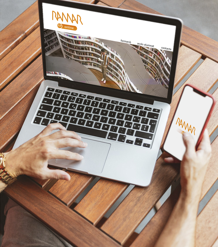
Nowadays digitization and new technologies promote new environments and media that leads us to propose related languages, or at least, worked from the potentiality that is presented to us. Ramar FP online is a new academic approach of the group that operates entirely in the digital environment.
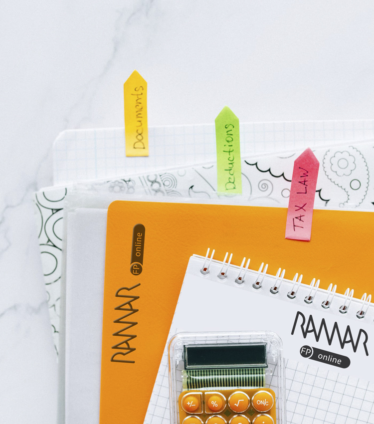
When we took on this new assignment, we were very clear about two aspects; On the one hand, the work done previously, its validity and the possible fit of the new image, and on the other, we did not lose sight of the fact that we are in a period of transition between the analog and digital world, specifically at that time when both stages cannot operate independently yet, and perhaps they never will – for the better-. This was what we were able to verify when studying how companies have moved from paper to screen. We do need codes rooted in a material and physical essence –interpretable from emotions and nature- that call us to use expressions with analogical roots that, precisely because of this, we manage to decode effortlessly. We are still human.


We proposed various design paths to the client, some of them truly disruptive vs. what could presumably be expected but were not chosen, simply because they were moving away from codes that are already fully internalized. Ramar is currently a brand with very strong roots. The selected proposal was a logical adaptation of the Ramar FP division, in the same way that so many other companies have been doing throughout these years, probably to preserve all the ground gained and not lose memory.
Ramar FP online is the expected image. It is the evolution and adaptation to the digital medium. Perhaps for this reason, the brand continues to retain all its value. This has been our bet.
Its structure is very simple, the color and the generic RAMAR remain intact, although a gradient level is incorporated. Starting from the “FP” circle, a collision is generated in its horizontal translation, which not only allows us to place the legend “online”, unequivocally showing what it is but also turning it into an activation button and “voilà”: We are ONLINE!


