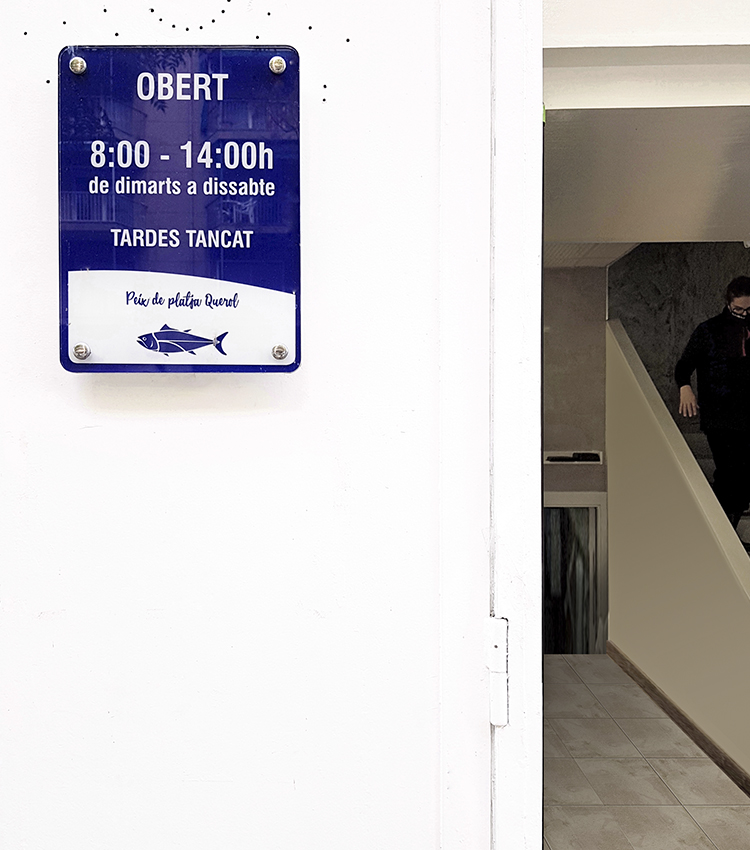
Corporate image · Querol’s Fish Shop
Querol’s Fish Shop corporate image.
The Querol’s Fish Shop has returned to the place where its owner learned the trade, a new location that has propitiated to renew the company’s corporate image to transmit quality, care of the product and the trade that it has treasured throughout all these years of history.
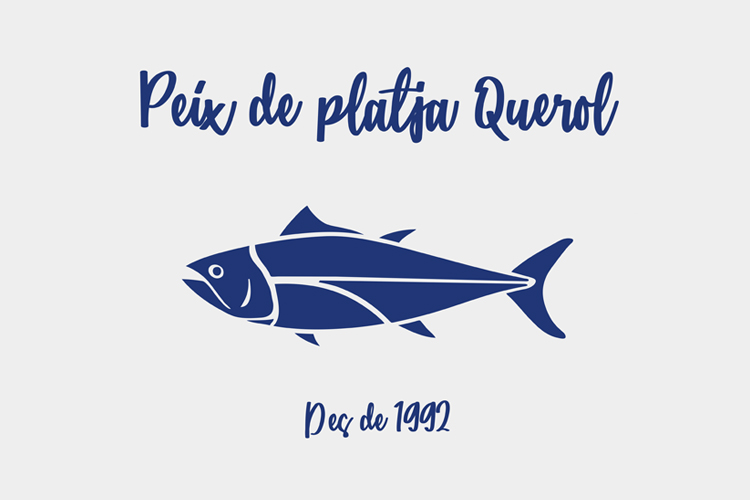
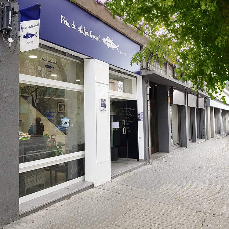
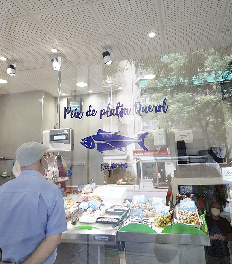
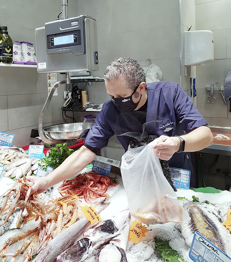
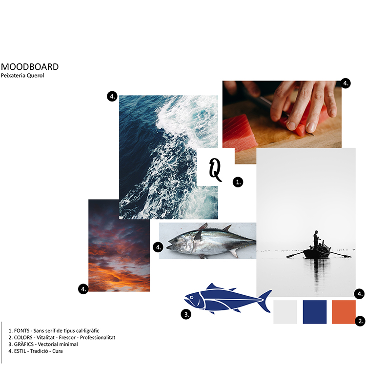
Being a local company that we knew very well, we were immediately clear when receiving the order that we had to communicate trade, closeness and freshness, understanding this last idea, not only as a refreshing particularity among the monotony seen in the sector but above all in reference to the high quality of the product. In this sense, we were committed to a very elegant range of pantones related to the ocean, with the PANTONE 2757 C as the protagonist, followed by Cool Gray 1C. A perfect color pairing.
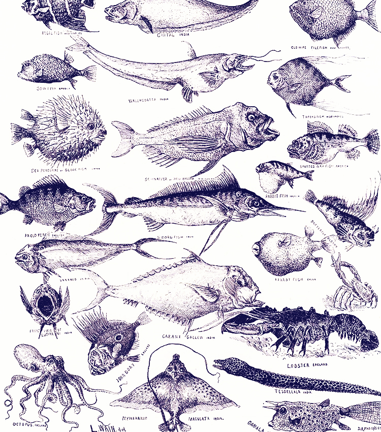
We also understood that, being a close family business, the lowercase letter and the apparently manual stroke fit perfectly and the Catarina typeface was a great ally to convey humanity and all those values we were looking for. A cheerful typography that also perfectly matches the texts that appeared in the old scientific sheets on which we relied to build the illustrative style that allowed us to speak about the experience and knowledge of the product.
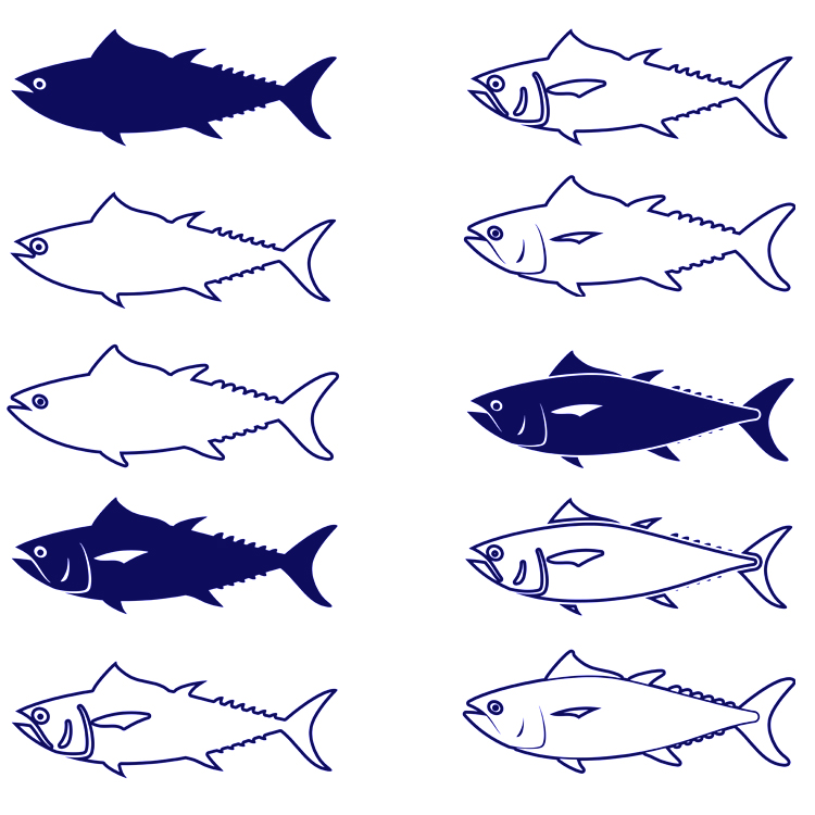
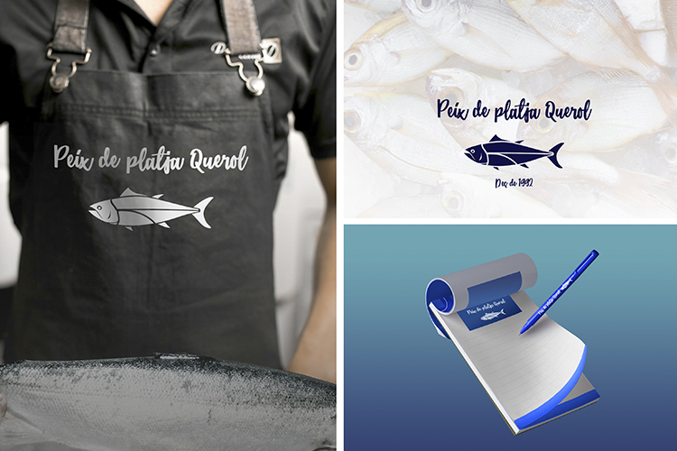
Our illustrated tuna, not only becomes from the simple and ancestral language that related the human being with the fauna and the fish, but also we took a reference from the food sector by emulating the linear and synthetic illustrations that were used in most retail establishments.
The result is a very close and friendly corporate image that matches perfectly into the landscape of the neighborhood – an issue that had strong meaning to specify the language that seems to have finally emerged from the anonymous popular tradition – but that also talks about affection for a trade and respect to the product. A graphic imprint of very different layers that are capable of transmitting messages at different levels of depth.
