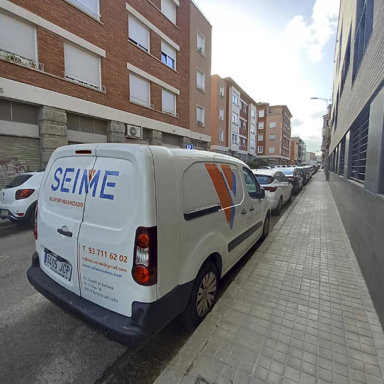
Brand · SEIME
SEIME’s corporate image
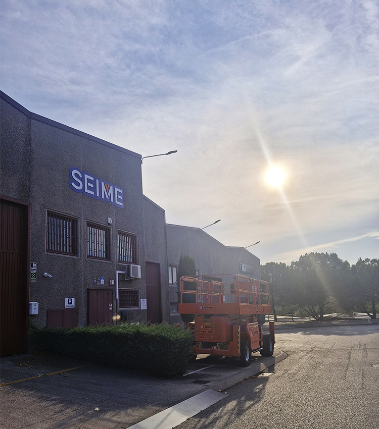
The project is based on the design and creation of the new corporate identity of the company “TALLERES SEIME”, which has been dedicated for 40 years to the machining of high-precision metal parts using, among other technologies, numerical control machine tools, mainly milling machines and lathes.
After analysing the sector, we considered that the design had to be contained and limited to the graphic-communicative-expressive field of this type of company, which is why we sought a result that, while being able to integrate perfectly into the existing symbology in this field, would also stand out among the competition: we have approached the stereotypes of the sector, but in a much more elegant, less obvious way.
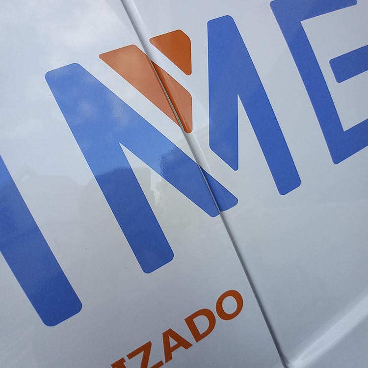
A font with a lot of character has been selected (Georgina Demo), which by presenting certain “breaks” helps us to incorporate the idea of machining, while placing us in an industrial environment.
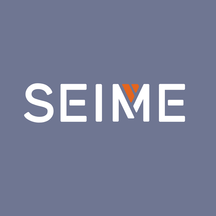
We worked on the brand in uppercase, which gives it a certain power and aggressiveness, adjectives that are very suitable for this type of company.
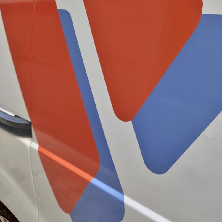
For the name, we prescribed a very sophisticated grayish blue color (PANTONE 646C), not only to stand out from the more common colors in this type of company, but also to reach out to new customers.
We took advantage of the architecture of the typography to include the idea of “strawberry” in the “M”, which we synthesized graphically through the diagonal lines that would represent a reduced portion of the usual cutting helices of these tools. A resource that we highlight in red (PANTONE 166C) providing power and vitality, not in vain when machining we are faced with hard materials that require strength to be worked. This detail works like an anagram (the main letter within a corporate image) and allows us to create much fresher, dynamic and richer applications, improving communication.
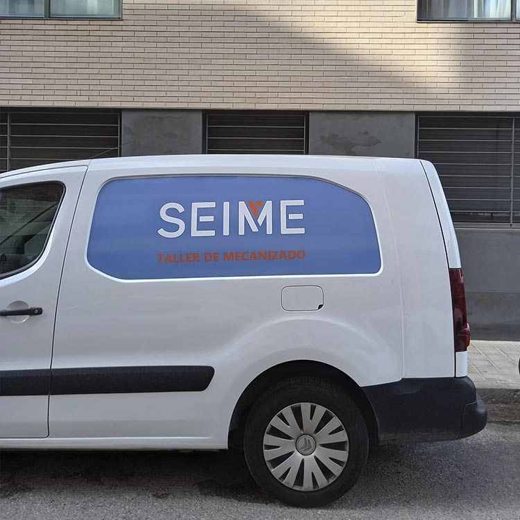
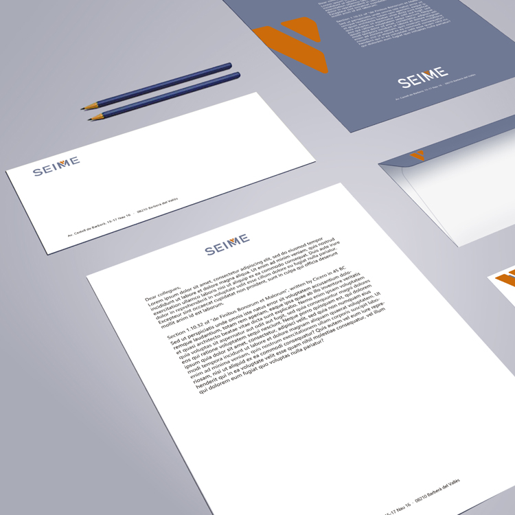
You can see how in the applications we combine the root brand with the legends, fully closing the communication circle in a very effective way.
In short, it is a brand that allows us to subtly get away from clichés, but keep one foot within tradition, which is never a bad thing.