Rowing adventure · David Barreiro
Rowing adventure, David Barreiro
We have had the privilege of drawing an emblem image on the adventure of David Barreiro, who is going to row across the Atlantic in a boat that he himself has built. This is a graphic design project that we have shared closely with this athlete who already surprised us a few years ago by going around the world on a bicycle, traveling 40,738 kilometers alone.


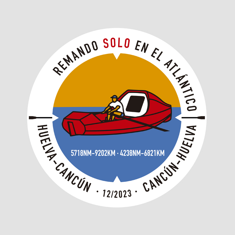
The emblem is full of symbolism and nothing is by chance, it synthesizes under a simple circular structure the entire universe of this enormous human feat.
Solved in 5 colors, we highlight the red boat that is centered on the horizon line that separates an orange sky – typical of the beginning and end of the day, moments that most invite to reflection – from a deep blue ocean full of mystery. The structure and composition quickly evokes the “artificial horizon” or AI instrumentation, typical of navigation systems in ships and aircraft, not in vain a trip of these characteristics needs the best and most precise orientation.


The illustration, with a fresh, simple, friendly and humane stroke, is surrounded by the descriptive legend and the itinerary, that we divide very clearly with two oars, which will be the only motor with which to face the sea. The selected typeface has been BARNA, we valued its exquisite sharpness and elegance. The descriptive ring on a white background comes to represent a lifesaver, closing a composition full of codes.
The 4 cardinal points also stand out, solved by using negative triangles on the background color, a resource that tells us about the need to always keep north in mind, so as not to get lost or even lose your mind.
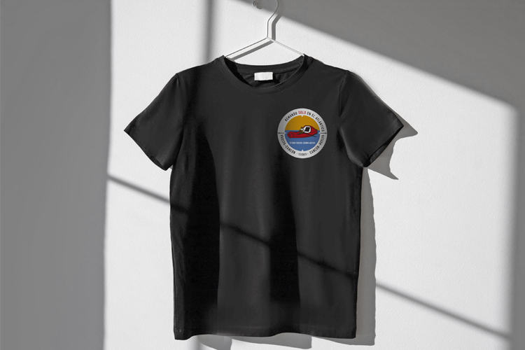
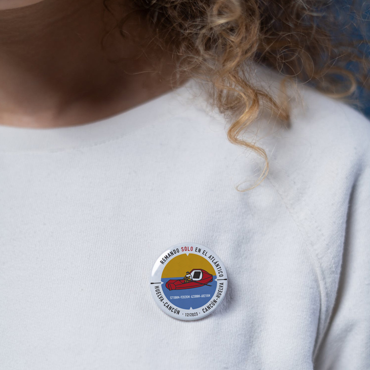
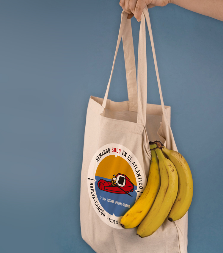
A compact and colorful icon that works very precisely in its smallest size scales and that integrates only the right and necessary elements to make up an image that must be quickly interpreted and, above all, memorized. This work has been quite a graphic adventure for us!
